Class 6: CSS Grid for Complex Layouts
In this class, we will explore CSS Grid Layout, a powerful and comprehensive CSS module designed for two-dimensional layout systems. While Flexbox excels at one-dimensional layouts (either a row or a column), CSS Grid allows you to define rows and columns simultaneously, making it ideal for designing entire page layouts or complex sections.
Introduction to CSS Grid for Two-Dimensional Layouts
Similar to Flexbox, CSS Grid operates with a
grid container (parent element) and
grid items (child elements). When you apply
display: grid or
display: inline-grid to an element, it becomes a
grid container, and its direct children automatically become
grid items.
Grid gives you precise control over the placement and sizing of elements within a defined grid structure of rows and columns.
Key Concepts:
-
Grid Container: The parent element with
display: grid. - Grid Items: The direct children of the grid container.
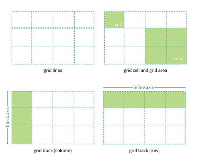
- Grid Lines: The dividing lines that form the grid structure (both horizontal and vertical).
- Grid Tracks: The spaces between two parallel grid lines (rows or columns).
- Grid Cells: The smallest unit of the grid, like a spreadsheet cell.
- Grid Areas: Named areas spanning multiple cells, useful for logical layout.

Grid Container Properties
These properties are applied to the
parent container (the element with
display: grid).
display: grid
This property defines an element as a grid container and enables a grid formatting context for its children.
// index.html
<div class="grid-container">
  <div class="item">Header</div>
  <div class="item">Sidebar</div>
  <div class="item">Content</div>
  <div class="item">Footer</div>
</div>
// styles.css
.grid-container {
display: grid;
background-color: #f0f0f0;
padding: 10px;
}
.grid-container > .item {
background-color: lightcoral;
border: 1px solid #ccc;
padding: 20px;
text-align: center;
}grid-template-columns
This property defines the number and width of the columns in your grid. You specify values for each column, separated by spaces.
-
px,%,em,rem: Fixed or percentage widths. auto: Takes up remaining space.-
fr(fractional unit): Distributes available space proportionally.1frmeans 1 part of the available space. -
repeat(count, value): A shorthand for repeating column definitions. -
minmax(min, max): Defines a size range for a track.
.grid-container {
  display: grid;
  grid-template-columns: 100px 1fr 2fr;
}
This creates three columns: the first is 100px wide, the second takes 1/3 of the remaining space, and the third takes 2/3 of the remaining space.
grid-template-rows
This property defines the number and height of the rows in your
grid, similar to grid-template-columns.
.grid-container {
  display: grid;
  grid-template-rows: auto 200px; /* First row auto-height, second row 200px tall */
}
grid-gap (or gap)
This property (now commonly referred to as gap)
defines the size of the gap between grid rows and columns. It's
a shorthand for grid-row-gap and
grid-column-gap.
.grid-container {
  display: grid;
  grid-template-columns: 1fr 1fr 1fr;
  grid-gap: 20px; /* Creates 20px gap between all rows and columns */
  /* Or using the newer 'gap' property: */
  /* gap: 20px; */
  /* gap: 10px 20px; /* 10px row gap, 20px column gap */
}
Placing Items in the Grid
These properties are applied to the child items directly within the grid container to control where they are placed.
grid-column
This property defines which grid lines an item starts and ends
on, horizontally. It's a shorthand for
grid-column-start and grid-column-end.
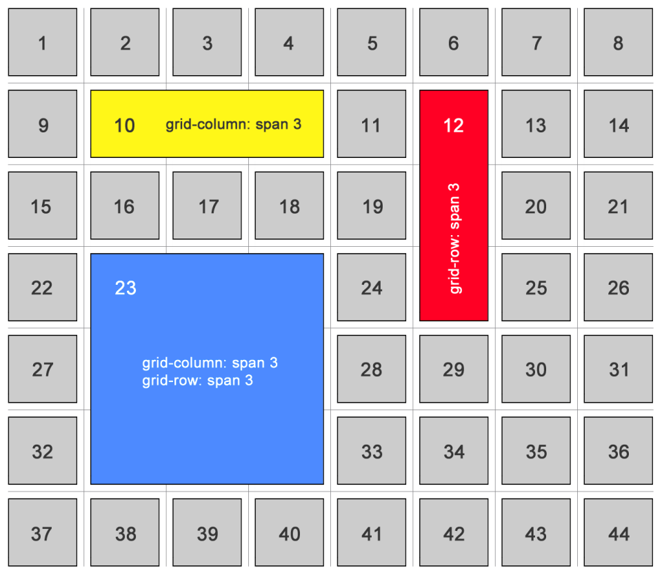
-
grid-column: 1 / 3;: Starts at column line 1, ends at column line 3 (spans two columns). -
grid-column: span 2;: Spans 2 columns from its starting position.
.header-item {
  grid-column: 1 / span 3; /* Item starts at line 1 and spans 3 columns */
  /* This means it will occupy the first, second, and third columns */
}
grid-row
This property defines which grid lines an item starts and ends
on, vertically. It's a shorthand for
grid-row-start and grid-row-end.
-
grid-row: 1 / 2;: Starts at row line 1, ends at row line 2 (spans one row). -
grid-row: span 2;: Spans 2 rows from its starting position.
.sidebar-item {
  grid-row: 2 / span 2; /* Item starts at line 2 and spans 2 rows */
  /* This means it will occupy the second and third rows */
}
grid-area (for named areas)
You can name areas of your grid using
grid-template-areas on the container, and then
place items into these named areas. This provides a very
readable way to lay out your page.
Container CSS:
.grid-container {
  display: grid;
  grid-template-columns: 1fr 3fr 1fr;
  grid-template-rows: auto 1fr auto;
  grid-template-areas:
    "header header header"
    "nav    main   aside"
    "footer footer footer";
}
Item CSS:
.site-header { grid-area: header; }
.site-nav    { grid-area: nav; }
.site-main   { grid-area: main; }
.site-aside  { grid-area: aside; }
.site-footer { grid-area: footer; }
Creating Responsive Page Layouts with Grid
CSS Grid is exceptionally good for full-page layouts. You can combine it with Media Queries (which we'll cover in the next class!) to create highly responsive designs that adapt drastically to different screen sizes.
Example: Simple Blog Layout
Let's imagine a layout with a header, main content, sidebar, and footer.
// index.html
<div class="blog-layout">
  <header>Blog Header</header>
  <aside>Sidebar</aside>
  <main>Main Content Area</main>
  <footer>Blog Footer</footer>
</div>
// styles.css
.blog-layout {
display: grid;
grid-template-columns: 200px 1fr; /* 200px sidebar, rest for content */
grid-template-rows: auto 1fr auto; /* Header, flexible content area, footer */
grid-template-areas:
"header header"
"aside main"
"footer footer";
min-height: 100vh; /* Ensure layout takes full viewport height */
gap: 15px;
}
.blog-layout > header { grid-area: header; background-color: #f8e8a6; padding: 20px; }
.blog-layout > aside { grid-area: aside; background-color: #d1f3ee; padding: 20px; }
.blog-layout > main { grid-area: main; background-color: #e6e6fa; padding: 20px; }
.blog-layout > footer { grid-area: footer; background-color: #a6bfe8; padding: 20px; }
/* For smaller screens, you might use a media query to change the grid-template-areas
and grid-template-columns to stack everything vertically, like this: */
@media (max-width: 768px) {
.blog-layout {
grid-template-columns: 1fr; /* Single column */
grid-template-areas:
"header"
"main"
"aside"
"footer";
}
}