Class 7: Responsive Web Design Principles & Media Queries
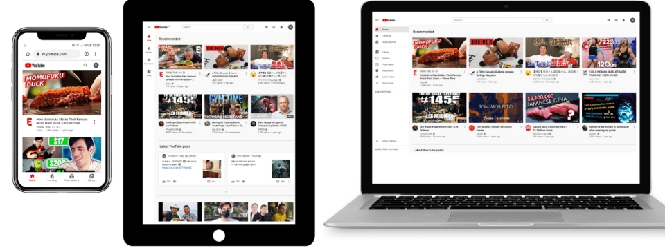
In today's digital landscape, users access websites on a vast array of devices, from small phones to large desktop monitors, and even smart TVs. Responsive Web Design (RWD) is an approach to web design that makes web pages render well on a variety of devices and window or screen sizes.
The Concept of Responsive Web Design
RWD ensures that your website provides an optimal viewing and interaction experience—easy reading and navigation with a minimum of resizing, panning, and scrolling—across a wide range of devices. Instead of creating separate websites for mobile and desktop, RWD aims for a single codebase that adapts its layout and content based on the user's device characteristics.
Key Principles of RWD:
-
Fluid Grids: Layouts that adjust and
rearrange themselves based on the screen size, often using
percentages or flexible units (like
frin Grid, orflexin Flexbox) instead of fixed pixel widths. - Flexible Images & Media: Media (images, videos) that scale proportionally to fit their containing elements, preventing overflow and maintaining aspect ratio.
- Media Queries: CSS rules that allow you to apply different styles based on device characteristics (e.g., screen width, height, resolution, orientation).
- Mobile-First Approach: Designing for the smallest screens first and then progressively enhancing the experience for larger screens. This approach helps ensure performance and accessibility for all users.

Setting Up the Viewport Meta Tag
The viewport is the user's visible area of a
web page. To make your website responsive, you must tell the
browser how to control the page's dimensions and scaling. This
is done using the <meta name="viewport"> tag
in the <head> section of your HTML.
The most common and recommended viewport meta tag for responsive design is:
<meta name="viewport" content="width=device-width, initial-scale=1.0">-
width=device-width: Sets the width of the viewport to the width of the device's screen (in device-independent pixels). -
initial-scale=1.0: Sets the initial zoom level when the page is first loaded by the browser. A value of 1.0 means no zoom.
Using CSS Media Queries (@media)
Media Queries are the cornerstone of Responsive Web Design. They allow you to apply CSS styles only when certain conditions are met (e.g., when the screen width is above or below a certain size, or when the device is in portrait or landscape orientation).
A media query consists of a media type (e.g.,
screen, print) and one or more media
features (e.g., max-width, min-width,
orientation).
Basic Media Query Syntax:
@media screen and (max-width: 600px) {
  /* CSS rules to apply when the screen width is 600px or less */
  body {
    background-color: lightblue;
  }
}

@media screen and (min-width: 601px) {
  body {
    background-color: lightgreen;
  }
}
Common Media Features:
-
min-width: Applies styles when the viewport is at least this wide. -
max-width: Applies styles when the viewport is at most this wide. -
orientation: Checks if the viewport is inportraitorlandscapemode. -
min-resolution/max-resolution: For high-DPI (Retina) screens. -
prefers-color-scheme: Detect if the user prefers a light or dark color scheme.
Example: Responsive Content Blocks
On larger screens, these blocks will try to arrange themselves side-by-side. As you narrow the browser window (or view on a mobile device), they will stack vertically. (try resizing your browser)
// index.html
<div class="responsive-example">
    <div>Content Block 1</div>
    <div>Content Block 2</div>
    <div>Content Block 3</div>
</div>
// styles.css
.responsive-example {
display: flex;
flex-wrap: wrap;
gap: 15px;
margin-top: 20px;
}
.responsive-example div {
background-color: #f2f2f2;
border: 1px solid #ccc;
box-sizing: border-box;
flex: 1 1 300px;
min-width: 0;
padding: 20px;
text-align: center;
}
@media (max-width: 768px) {
.responsive-example {
flex-direction: column;
}
.responsive-example div {
flex: 1 1 auto;
}
}Another Example: Background color change
// index.html
<div class="media-query-example">
    This box changes color based on screen width.
</div>
// styles.css
.media-query-example {
background-color: lightblue;
border: 1px solid #007bff;
color: black;
margin-top: 20px;
padding: 20px;
text-align: center;
}
@media (min-width: 769px) and (max-width: 1024px) {
.media-query-example {
background-color: lightgreen;
color: darkgreen;
font-size: 1.1em;
}
}
@media (max-width: 600px) {
.media-query-example {
background-color: lightcoral;
color: white;
}
}Breakpoints and Designing for Different Devices
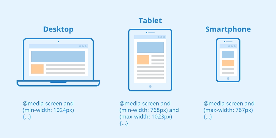
Breakpoints are the points at which a website's content and layout will adapt to provide the best possible user experience. There are no fixed rules for breakpoints; they should be determined by your content and design, not by specific device widths.
- Common Breakpoint Philosophy: Start with a mobile layout, then add breakpoints where your design starts to look "broken" or could be improved on larger screens.
-
Example Breakpoints:
- Small phones: up to 480px
- Smartphones: 481px - 767px
- Tablets: 768px - 1023px
- Desktops & large screens: 1024px and up

CSS Pseudo-classes and Pseudo-elements
Beyond standard selectors, CSS provides powerful features called pseudo-classes and pseudo-elements. These allow you to apply styles based on states or specific parts of an element without needing to add extra classes or IDs in your HTML.
Pseudo-classes (:)
Pseudo-classes select elements based on a specific state or
position. They begin with a single colon (:).
-
:hover: Selects an element when the user's mouse pointer is over it. -
:active: Selects an element while it is being activated by the user (e.g., clicked). -
:focus: Selects an element when it has received focus (e.g., from a tab key press or click on an input field). -
:first-child/:last-child: Selects an element that is the first/last child of its parent. -
:nth-child(n): Selects an element that is the nth child of its parent. -
:not(selector): Selects elements that do not match the specified selector. -
:link/:visited: Selects unvisited/visited links.
a:hover {
  color: #ff6347; /* Tomato */
  text-decoration: underline;
}

button:active {
  background-color: #5cb85c;
  transform: translateY(1px);
}

input:focus {
  border-color: dodgerblue;
  box-shadow: 0 0 5px dodgerblue;
}
Pseudo-elements (::)
Pseudo-elements select a part of an element. They begin with a
double colon (::) to distinguish them from
pseudo-classes, though the single colon syntax (e.g.,
:before) is also valid for backward compatibility.
-
::before: Inserts content before the content of an element. Requires thecontentproperty. -
::after: Inserts content after the content of an element. Requires thecontentproperty. -
::first-line: Selects the first line of a block-level element. -
::first-letter: Selects the first letter of a block-level element. -
::selection: Applies styles to the portion of an element that is selected by the user.
p::first-line {
  font-weight: bold;
  color: navy;
}

h2::after {
  content: " ✨";
}

blockquote::before {
  content: "“";
  font-size: 2em;
  vertical-align: -0.4em;
  margin-right: 0.1em;
}