
Class 5: Flexbox for Responsive Layouts
In this class, we will dive into Flexbox, a powerful CSS layout module designed for laying out, aligning, and distributing space among items in a container, even when their size is unknown or dynamic. Flexbox is primarily used for one-dimensional layouts (either a row or a column) and is an essential tool for building responsive web designs.
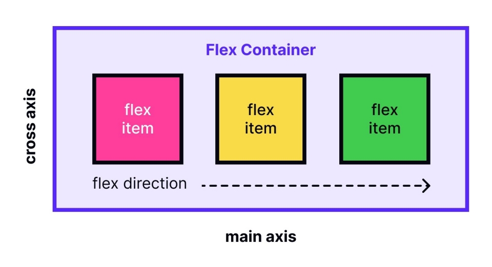
Introduction to Flexbox for One-Dimensional Layouts
Flexbox works with a flex container (parent
element) and flex items (child elements). When
you apply display: flex or
display: inline-flex to an element, it becomes a
flex container, and its direct children automatically become
flex items.
The core idea of Flexbox is to give the container the ability to alter its items' width/height (and order) to best fill the available space.
Key Concepts:
- Main Axis: The primary axis along which flex items are laid out. This can be horizontal (row) or vertical (column).
- Cross Axis: The axis perpendicular to the main axis.
-
Flex Container: The parent element with
display: flex. - Flex Items: The direct children of the flex container.
Flex Container Properties
These properties are applied to the
parent container (the element with
display: flex).
display: flex
This property defines a flex container and enables a flex context for all its direct children.
// index.html
<div class="flex-container">
  <div>Item 1</div>
  <div>Item 2</div>
  <div>Item 3</div>
</div>
// styles.css
.flex-container {
display: flex;
background-color: #f0f0f0;
}
.flex-container > div {
padding: 15px;
margin: 10px;
background-color: lightblue;
}
In this example, the div items will automatically
arrange themselves in a row.
flex-direction
This property establishes the main axis, thus defining the direction flex items are placed in the flex container.
-
row(default): Items are arranged horizontally, from left to right. -
row-reverse: Items are arranged horizontally, from right to left. -
column: Items are arranged vertically, from top to bottom. -
column-reverse: Items are arranged vertically, from bottom to top.
.flex-container {
  display: flex;
  flex-direction: column; /* Items will stack vertically */
}
justify-content
This property aligns flex items along the main axis. It helps distribute extra free space left over when either all the flex items on a line are inflexible, or are flexible but have reached their maximum size.
-
flex-start(default): Items are packed toward the start of the flex-direction. -
flex-end: Items are packed toward the end of the flex-direction. center: Items are centered along the line.-
space-between: Items are evenly distributed in the line; first item is at the start, last item at the end. -
space-around: Items are evenly distributed in the line with equal space around them. -
space-evenly: Items are distributed so that the spacing between any two items (and the space to the edges) is equal.
.flex-container {
  display: flex;
  justify-content: center; /* Horizontally centers items if flex-direction is row */
}
align-items
This property aligns flex items along the cross axis of the current line.
-
stretch(default): Items stretch to fill the container (still respectsmin-width/max-width). -
flex-start: Items are placed at the start of the cross axis. -
flex-end: Items are placed at the end of the cross axis. -
center: Items are centered on the cross axis. -
baseline: Items are aligned such that their baselines align.
.flex-container {
  display: flex;
  align-items: center; /* Vertically centers items if flex-direction is row */
  height: 200px; /* Give container a height to demonstrate alignment */
}
Flex Item Properties
These properties are applied to the child items directly within the flex container.
flex-grow
This property specifies how much a flex item will grow relative to the rest of the flex items when there is available space in the flex container. It accepts a unitless proportion.
0(default): The item will not grow.-
1: The item will grow to take up available space. -
2,3, etc.: The item will grow proportionally more than others.
// index.html
<div class="flex-container">
  <div style="flex-grow: 1;">Item A</div>
  <div style="flex-grow: 1;">Item B</div>
  <div style="flex-grow: 2;">Item C</div>
</div>
// styles.css
.flex-container {
display: flex;
width: 500px; /* Fixed width to show growth */
}
If there's 100px of extra space, Item A gets 25px, Item B gets
25px, and Item C gets 50px (because its
flex-grow value is twice that of A and B).
flex-shrink
This property specifies how much a flex item will shrink relative to the rest of the flex items when there is not enough space in the flex container. It also accepts a unitless proportion.
1(default): The item will shrink.0: The item will not shrink.-
2,3, etc.: The item will shrink proportionally more than others.
.flex-item {
  width: 200px; /* Desired width */
  flex-shrink: 0; /* Prevent this item from shrinking */
}
flex-basis
This property defines the default size of an element
before the remaining space is distributed. It
can be a length (e.g., 100px, 20%) or
the keyword auto (which means "look at my
width/height property, or my content's size").
-
auto(default): Uses the item'swidthorheightproperty. If not set, it defaults to the content size. -
length: A specific value like150pxor20%.
.flex-item {
  flex-basis: 150px; /* This item will try to be 150px wide initially */
  flex-grow: 1;      /* And grow if there's extra space */
}
Shorthand flex property:
The flex shorthand property combines
flex-grow, flex-shrink, and
flex-basis in that order.
flex: 1 1 auto; /* (default) */
flex: 1; /* (shorthand for "flex: 1 1 0%;" for growing items that shrink to 0 initially) */
flex: 0 0 200px; /* (shorthand for a fixed-size item that neither grows nor shrinks) */
Building Simple Responsive Navigation Bars and Content Sections
Flexbox is incredibly useful for common web design patterns.
Responsive Navigation Bar
A common use case is a horizontal navigation bar that can adapt.
// index.html
<nav class="navbar">
  <a href="#">Home</a>
  <a href="#">About</a>
  <a href="#">Services</a>
  <a href="#">Contact</a>
</nav>
// styles.css
.navbar {
display: flex; /* Makes items arrange in a row */
justify-content: space-around; /* Distributes items with space between them */
align-items: center; /* Vertically centers items */
background-color: #333;
padding: 10px 0;
}
.navbar a {
color: white;
text-decoration: none;
padding: 8px 15px;
border-radius: 5px;
}
This will create a navigation bar where links are evenly spaced.
If the screen gets smaller, the links might start to overlap
unless you add media queries or allow them to wrap (using
flex-wrap: wrap; on the container).
Content Sections / Card Layout
You can create simple grid-like layouts for content cards or product listings.
// index.html
<div class="card-container">
  <div class="card">Card 1</div>
  <div class="card">Card 2</div>
  <div class="card">Card 3</div>
  <div class="card">Card 4</div>
</div>
// styles.css
.card-container {
display: flex;
flex-wrap: wrap; /* Allows items to wrap to the next line */
justify-content: space-around; /* Distributes cards with space */
gap: 20px; /* Space between cards, available in newer CSS */
padding: 20px;
}
.card {
flex-basis: 280px; /* Base width for each card */
flex-grow: 1; /* Allows cards to grow and fill space */
flex-shrink: 1; /* Allows cards to shrink if needed */
background-color: #fff;
border: 1px solid #ddd;
padding: 20px;
text-align: center;
box-shadow: 2px 2px 8px rgba(0,0,0,0.1);
}This setup allows cards to sit side-by-side on larger screens and then wrap neatly onto new lines as the screen size decreases, making them responsive.